Community
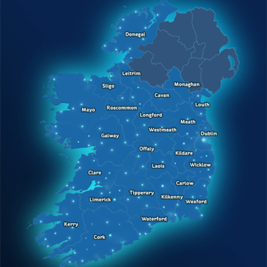
Learn how your community compares to others across the country
Communities across Ireland are helping build a more sustainable electricity future. Select a county below to explore local demand, generation, participation in ESB Networks flexibility initiatives, and future flexibility targets. Check back regularly to see how your county is progressing and compare results nationwide.
Renewable energy ranking
- Select a county below to see how it compares across Ireland. Each county is ranked between 1 and 26 based on their renewable energy mix.
- You’ll see statistics on demand, flexible product and technology update which all feed into the county score.
- This ranking is updated monthly.
Explaining red & green indicators
- Red indicator: When you select a county, where the figure is shown as red, this means it is performing poorer than the national averages.
- Green indicator: When you select a county, where the figure is shown as green, this means that it is as good, or better than the national averages.
County ranking
Each county is ranked between 1 and 26 based on their renewable energy mix.
Energy demand
Flexible products
0 people in this county responded to the latest national event as part of our domestic ‘Is This a Good Time?’.
Technology uptake
For more info on flexible technology uptake in your area, please visit the SEAI website here.